CRESCYNT Toolbox – R Resources for Graphing and Visualization

In a previous post we offered some solid supportive resources for learning R – a healthy  dinner with lots of great vegetables. Here we offer a dessert cart of rich resources for data visualization and graphing. It’s a powerful motivation for using R.
rgraphgallery

First up is The New R Graph Gallery – extensive, useful, and actually new. “It contains more than 200 data visualizations categorized by type, along with the R code that created them. You can browse the gallery by types of chart (boxplots, maps, histograms, interactive charts, 3-D charts, etc), or search the chart descriptions. Once you’ve found a chart you like, you can admire it in the gallery (and interact with it, if possible), and also find the R code which you can adapt for your own use. Some entries even include mini-tutorials describing how the chart was made.” (Description by Revolutions.)

Sometimes we want (or need) plain vanilla – something clean and elegant rather than extravagant. Check out A Compendium of Clean Graphs in R, including code. Many examples are especially well-suited for the spartan challenge of conveying information in grayscale. The R Graph Catalog is a similar resource.

If you’re just getting started with R, take a look at the Painless Data Visualization section (p. 17 onward) in this downloadable Beginner’s Guide.

In R, ggplot2,  based on the Grammar of Graphics, is perhaps the single most popular R package for data visualization. The R Cookbook‘s section on Graphs using ggplot2 is a helpful precursor to the R Graphics Cookbook. DataCamp’s DataVis with ggplot2 has a free segment of intro lessons.

For more on visualization and other capabilities, check out this recommended list of useful R packages in the R Studio support blog – succinct and terrific.

If you’re already skilled in R and want a new challenge, an indirect method of harnessing some of the power of D3.js for interactive web visualizations is available through plotly for R. Here’s getting started with plotly and ggplot2, plotly and Shiny, and a gallery. The resources offer code and in some cases the chance to open a visualization and modify its data.

Have a favorite resource? Please share as a comment, or email us!

CRESCYNT Toolbox – R Resources for Graphing and Visualization

CRESCYNT Toolbox – Learning to Love R More (or R is for Reproducible)

caribbean_reef_shark_wikimediacommons_albertkokWe are driven to learn like sharks: constantly take in new flows, or die. In a recent workshop, when coral reef scientists were asked: “How many of you use R?” 60% raised a hand. To: “How many of you are comfortable with and love using R?” only about 15% kept a hand up.

Here’s where to go to learn to love R more.

rlogoYou likely already know of the R Project, free and open source software for statistical computing and graphics. You may already know of the reliability of the Comprehensive R Archive Network or CRAN repository, favored by many over other potential sources of community-generated code because of their metadata and testing requirements; it now hosts over 9,300 packages (sorted by date and name).

You may also know the elegance of RStudio, the excitement of putting your own interactive code online in RStudio’s Shiny, some great cheat sheets, the most popular R packages, and Stack Overflow as a great place to find answers to your R questions.

You may not know of the new R course finder, an online directory you can search and filter to find the best online R course for your next step (note there are often free versions or segments of even the pay courses listed). There are YouTube videos for R learning, like  twotorials (two-minute tutorials) and YaRrr! (because pirates) with book.

A very recent new book is getting rave reviews from both statistics and programming viewpoints: The Book of R by Tilman Davies (preview it here). The author writes:

“The Book of R …represents the introduction to the language that I wish I’d had when I began exploring R, combined with the first-year fundamentals of statistics as a discipline, implemented in R….   Try not to be afraid of R. It will do exactly what you tell it to – nothing more, nothing less. When something doesn’t work as expected or an error occurs, this literal behavior works in your favor….   Especially in your early stages of learning…try to use R for everything, even for very simple tasks or calculations you might usually do elsewhere. This will force your mind to switch to ‘R mode’ more often, and it’ll get you comfortable with the environment quickly.”

Because R is such a  stellar example of free and open source software with a very robust community (e.g., great stuff at r-bloggers), it’s a surprise how lucky we are that it IS open source, as heard in this interview with R founder Hadley Wickham on the DataStori.es podcast.

We’ll soon host a guest blogpost on some exploratory coral symbiont data analyses, visualizations, and comments generated in R Markdown, which is RStudio’s method for preserving code and output in one running web document. The work is beautiful and useful, and highlights the use of an electronic notebook as a way to capture and share data exploration, analysis and visualization, and to tell a data story. (A major advance to that software was announced this week in the form of R Notebook, which will ship within the next couple of months.)

Why is it worth learning to love R more?

R helps make sure your data work is reproducible (such an issue for science), repeatable (valuable for any processing you have to do periodically), and reusable (on other datasets or data versions, or by colleagues or your future self).

A couple of high-level languages, like R and Python, are becoming more popular each year, and are finding their way as general purpose tools into analytical platforms. These will serve as primary sources of flexibility in cyberinfrastructure platforms now available or under development. Our future selves thank us for the learning investment.

2016 Top 10 Tools for Analytics and Data Science - KD Nuggets Software Poll
R, Python Duel As Top Analytics, Data Science software – KDnuggets 2016 Software Poll Results  (click graph)

Update: speaking of interviews with R makers, here’s an October 2016 interview with JJ Allaire, the creator of RStudio, Shiny, and R Markdown. His advice for people new to R:

I would suggest that they get a copy of the R for Data Science book written by Hadley Wickham and Garrett Grolemund…. Also, when you have questions or run into problems don’t give up. There’s a lot of great activity around R on stackoverflow and other places and there’s an excellent chance you’re going to find the answers to your questions if you look carefully for them.

Further Update: In January 2018, Kaggle released resources for Hands-On Data Science learning, including lessons for R in data setup, data visualization, and machine learning.

CRESCYNT Toolbox – Learning to Love R More (or R is for Reproducible)

CRESCYNT Toolbox – Powerful Temperature Visualizations

Temperature is a critical environmental parameter that has profound relevance in describing where coral reefs do and do not occur, and growing direct and indirect threats to their existence.

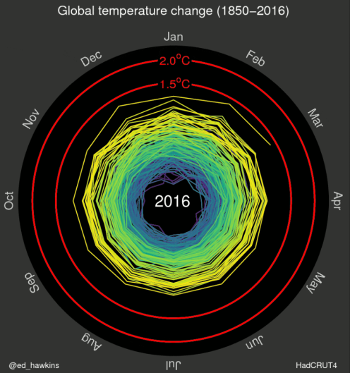
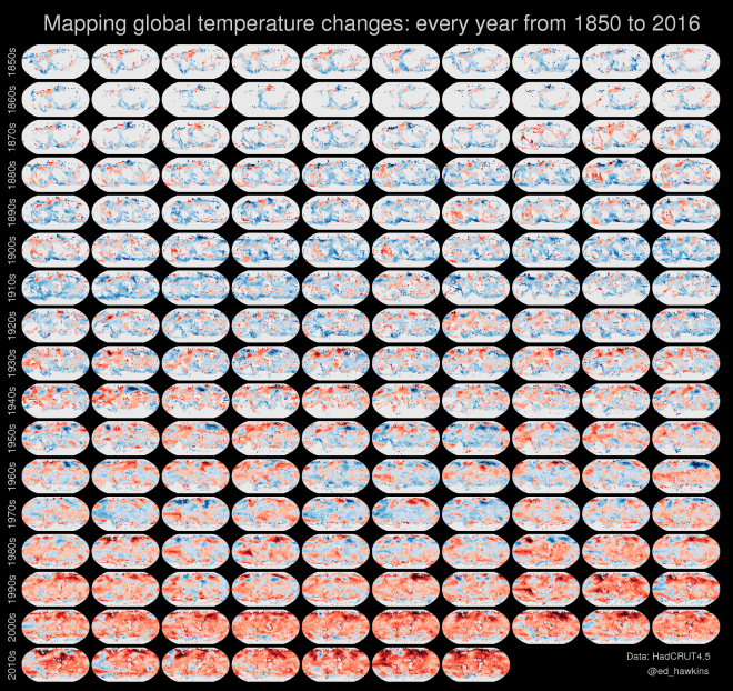
Here are some powerful visualizations of global temperature data you may find useful or want to replicate for local or global temperature datasets, or use for education and outreach about climate change.

First, spiralling global temperatures by Ed Hawkins (using MATLAB):

ed_hawkins_globaltempchange_spiral
Click to animate.     Author: Ed Hawkins

The climate spirals page of Hawkins’ Climate Lab Book features global temperature change updates, as well as atmospheric CO2 and arctic sea ice volume animations. His small multiples assembly of global temperatures by decade is very useful, and could be used to describe sequential environmental changes on regional map scales as well.

edhawkins_smmult_year_2016_nobar

Ed Hawkins also links to Robert Geiseke and Malte Meinshausen’s interactive tool and a set of video animations for offline use that build upon his work.

NASA’s temperature graphs and charts are varied and useful, and have pages for downloading different temperature products for specific date ranges, including global maps, surface temperature animations, and this 135-year time chart of zonal temperature anomalies:

nasa_giss_ztmap

See NASA’s Global Climate Change – Global Temperature site for rich multimedia resources and apps, including global temperature anomaly maps with year sliders and an embeddable 3-min video which graphs different potential factors with global temperature changes (surprise: the correlation is with anthropogenic CO2). High global temperatures and low Arctic sea ice cover both broke records in the first half of 2016.

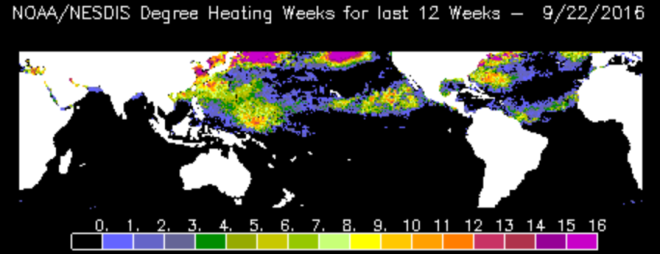
NOAA has its own further derivations of very useful temperature representations, particularly for coral reef work, including global and regional sea surface temperature contour maps,  a suite of coral bleaching data products with predictive bleaching alerts derived from virtual stations, and their degree heating weeks maps, which some NOAA scientists prefer as their most accurate post-event indicator of peak bleaching intensity.

noaa_dhw_20160922

Thanks for inspiration to Andrew Freedman’s excellent article on Mashable featuring compelling temperature visualizations.

If there’s a temperature visualization you love – including simple – simple is good – please share it with us by leaving a comment. Thanks.

Update: (1) fresh updated graphs and more at Ed Hawkins’ Climate Lab Book (or follow on Twitter: @ed_hawkins), and (2) check out Antti Lipponen’s temperature anomalies by country since 1900 – as animation or small multiples – showing variation and warming trends, with visual insight into continents.


>>>Go to the blog Masterpost or the CRESCYNT website or NSF EarthCube.<<<

CRESCYNT Toolbox – Powerful Temperature Visualizations

CRESCYNT Toolbox – Stitched Images – 3D Reef Mapping and 360-Degree Imagery

Imagery REALLY feeds our monkey brains. Today: tools for 3D reef mapping. Bonus: some 360-degree images and video to use with virtual reality headsets.

Several exciting talks at the International Coral Reef Symposium featured 3D mapping of coral reefs using SfM, Structure from Motion techniques, to stitch together large numbers of overlapping images. The resulting 3D mapped images were used to help address a surprising range of research questions. The primary tools used to create these were Agisoft’s PhotoScan or the free and open source Bundler (github) by Noah Snavely.  Part of the challenge of this difficult work is organizing the workflows and data processing pipelines: it’s an example of a type of cyberinfrastructure need that eventually EarthCube architecture should be able to help stage. Look for a guest blog soon by John Burns to learn more!

valensreef2
360 Film by Conservation International

BONUS: The process of creating spherical or 360-degree images or video is at root a similar challenge of stitching together images, though more of the work is done inside a camera or on someone else’s platform. There are some recent beautifully-made examples of spherical coral reef images and 360 videos, viewable through virtual reality (VR) headsets; these have great potential for education and outreach. Consider the XL Catlin Seaview Survey gallery of coral reef photo spheres and videos from around the world, (including bleaching and before-and-after images) and Conservation International’s 8-minute video, Valen’s Reef, both exhibited at the current IUCN World Conservation Congress in Honolulu.

catlinseaviewsurvey
Catlin Seaview Survey – equipment

A new project, Google Expeditions, was launched this past week to facilitate synchronized use by multiple people of 360 videos and photo spheres as a design for class use. Google Streetview is being made more accessible as a venue for education and outreach, including creating and publishing one’s own photo spheres. Also find 360-videos of coral reefs on YouTube.

UPDATE: Visually powerful 360 bleaching images that Catlin Seaview debuted at ICRS, viewed by tablet or smartphone, are now accessible in this article on coral bleaching.

>>>Go to the blog Masterpost or the CRESCYNT website or NSF EarthCube.<<<

CRESCYNT Toolbox – Stitched Images – 3D Reef Mapping and 360-Degree Imagery

WELCOME to CRESCYNT – the Coral Reef Science and Cyberinfrastructure Network

The Coral Reef Science & Cyberinfrastructure Network (CRESCYNT) is a multi-tiered and multidisciplinary network of coral reef researchers, ocean scientists, cyberinfrastructure specialists, and computer scientists, and we invite you to join us. Scope of Sciences within EarthCube

As an EarthCube Research Coordination Network, our goals are to foster a dynamic, diverse, durable, and creative community; to collectively consider and develop standards and resources for open data, research documentation, and data interoperability while making best use of work already accomplished by others; and to offer input to those groups within EarthCube who will ultimately create the data architecture for all of EarthCube. Along the way CRESCYNT expects to collect and share community resources and tools, and to offer training opportunities in topics prioritized by our members through widely accessible formats such as webinars and their recordings. We will also work to nurture unforeseen collaborative opportunities that emerge from our integrated collective work.

Because the coral reef community has exceptionally diverse data structures and analysis requirements needed to forward integrative science, it is an exemplar for cyberinfrastructure-enabled advances to other geosciences communities. The CRESCYNT network is working to match the data sources, data structures, and analysis needs of the coral reef community with current advances in data science, visualization, and image processing from multiple disciplines to advance coral reef research and meet the increasing challenges of conservation. The network has begun to assemble to coordinate, plan, and prioritize cyberinfrastructure needs within the coral reef community.

Workflows within CReSCyNT: participants to nodes to collective project outputsThe structure of CRESCYNT is a network of networks, currently including 18 disciplinary nodes and 7 technological nodes, where each network node represents an area of coral reef science (disciplinary nodes: e.g., microbial diversity, symbiosis regulation, disease, physiology & fitness, reef ecology, fish & fisheries, conservation & management, biogeochemistry, oceanography, paleontology, geology) or an area of computer science or technical practice (technological nodes: e.g., visualization, geospatial analysis & mapping, image analysis, legacy & dark data, database management). These nodes may expand, coalesce, or divide to meet the needs and interests of the subdisciplinary communities, while maintaining connections to CRESCYNT through node coordinators and ongoing network activities. We invite you to become a member of CRESCYNT, join one or more nodes that would advance your own work, collaborate on shared resources and tools for the coral reef community, and ensure that the data architecture and cyberinfrastructure of EarthCube will meet the needs of the coral reef community, and that broader data interoperability within EarthCube will benefit both coral reefs and our ability to answer complex questions.

PLEASE VISIT OUR WEBSITE at http://crescynt.org to enroll in CRESCYNT, join a node, work on tasks, discuss data and research priorities, and help determine the future shape of cyberinfrastructure for supporting coral reef research and other geoscience work. This collaborative work is supported by the NSF EarthCube initiative.  Dr. Ruth D. Gates, Director of the Hawaii Institute of Marine Biology, University of Hawaii, is the Principal Investigator of the CRESCYNT project. The CRESCYNT blog is written by Dr. Ouida Meier, the project’s program manager (crescyntrcn@gmail.com).

This material is based upon work supported by the National Science Foundation under Grant Number 1440342. Any opinions, findings, and conclusions or recommendations expressed in this material are those of the authors and do not necessarily reflect the views of the National Science Foundation.

>>>Go to the blog Masterpost or the CRESCYNT website or NSF EarthCube.<<<

WELCOME to CRESCYNT – the Coral Reef Science and Cyberinfrastructure Network